Tuesday 28 September 2010

Analysis of a music video

Sia Furler- Breathe me


Sia Kate Isobelle Furler (born 18 December 1975), also known simply as Sia, is an Australian soulful jazz-styled pop singer and songwriter. At the 2009 Aria Awards, she won the award for Best Music DVD and Some People Have Real Problems was nominated for Best Breakthrough Artist Album. She is noted for her work with Zero 7 and her three major label solo albums. I have chosen to anaylis one of her music videos as Sia is one of Maxine Vauzelles influences.


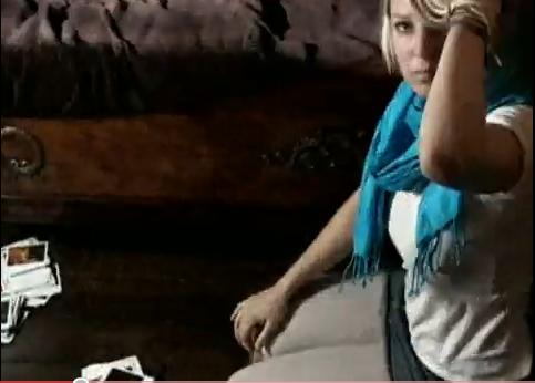
As a solo artist a majority are the shots are based on her, the camera follows her around and they have used a clever composition technique of polariod shots being shown quickly to animate her movements.

At the beginning of the video there is a fade to white transition as the music begins. The mise en scene is old fashioned, suiting her unique style of voice. The colours within the shot are very dim, and the use of polariod pictures emphasize the vintage theme. This is a mid-shot, the camera is following her around the room, it effectivley makes the viewer feel like they are in the room with her.
The video is set in what appears to be an old victorian house, in London, we can tell that it is situated in London when she goes outside at the end of the video.


 The old fashioned theme is continued, with the vitage pattenered wallpaper and dull colours. This is an over the shoulder shot of her looking into the mirror, she looks unsettled.
The editing of the video is quite upbeat in comparison to the slow tempo of the song, however the video fits in well with the song, as it shows her alone and unhappy not knowing what to do, and the song is quite depressing including lyrics such as, 'hurt myself again today...', hence the dim lighting, which creates the atmosphere. The fast cuts between each polariod keeps the viewer intrested.


Throughout the video the artist has been dressed in a simple night gown, but as she looks in the mirror a shot of her with a strange mask on appears, this brings a sense of surrealism to the video, showing shes a unique artist, there is then another shot of her in a colourful fancy dress costume.
There are no instruments show in this video, as she only sings, it is therefore only focused on her.
The video follows the song structure well for example, when the lyrics are 'be my friend, wrap me up', it shows her on her own looking like she needs somebody, the lighting gives her an innocent yet sad appearance.


 Here is a high angled shot, looking down on her sad expression near the polariod pitctures. In the mise en scene everything is dark, even the wood. However, she is now wearing something abit more modern, casual and brighter. There is then a zoom in and extreme close up of the polariod pictures and the composition technique is continued.


 This panning shot shows all the polariod pictures used in the film, this is an effective shot as it shows the video was not computirised. They look jumbled, representing the lack of care for the artist has for herself within the song and video. The camera moves very fast past all of this and straight back to the artist.


Maxine Vauzelle

Maxine Vauzelle is a solo acoustic/blues/soul artist who lives in Australia, she has a unique voice and her influences are listed below;


Sufjan Stevens // Camille // Micky Green // The Doors // Pink Floyd // Kate Bush // Mary Black // Angus + Julia Stone // Frente // Margi Gibb // Clare Bowditch // Sia // The Cure // Kora // True Live // Horrorshow // Adele // Iron and Wine // Mama Kin // Bon Iver // Donny Hathaway // Jenny Wilson // Foals // Janelle Monae // The Whitest Boy Alive // The Phenomenal Handclap Band// Yesayer // Kimbra // Phil Collins

Digipak

Digipak is a patented style of compact disc or DVD packaging, and is a registered trademark of AGI Media, a MeadWestvaco, Inc. resource, which acquired the original trademark holder, IMPAC Group, Inc., in 2000. MeadWestvaco licensed the name and designs to manufacturers around the world

The pros of Digipaks-

  • Eye catching/aesthetically pleasing/different
  • Shatterproof-they don’t crack
  • Cheap to produce
  • Good for display of graphics
  • Environmentally friendly
  • Can accommodate all sorts of needs
  • Innovative premium product
  • More visuals/info on display
  • A bespoke solution- lots of possibilities
  • More design options
  • More room display

Friday 24 September 2010

Groupings and Genre

I have chosen to work towards producing my music video with Clodagh Breen and Sophie Dash. Whilst browsing Unsigned Artists we came across a Australian female acoustic solo artist, Maxine Vauzelle. Before beginning the research process we were certain we wanted to use an acoustic artists. We never really thought of the idea of using a female. We looked at various male artists such as Anton Brello and Aaron Kemp. However, when we came across Maxine we knew her unique voice was the style we were looking for.

Clodagh Breen's strengths- is capable of using her imagination to create effective and suitable ideas for our chosen genre. She will play a big part in chosing the perfect picturesque setting for our music video.

Sophie Dash's strengths- is very confident with the technical aspects within the editing process, for example, using different programmes on the macs, and using the different tools on programmes such as photoshop. This will be particularly helpful during the editing process to ensure we get our video to the highest standard possible.

My strengths- I make a confident contribution to the filming process, planning shots and shooting them several times from differerent angles to ensure we get plenty of footage to choose from. You went away too fast to say yeaaah
Goodbye and hold my hand
I don’t understand why you be doing this
Boy, just come on over I got something to show ya and it cannot wait
Now boy don’t be acting hazey when you feel a little crazy
and its not too late, oh no, no its not too late yeaah

He tries to tell me, but it gets old
and im just tryna break him out of his stupid mode
Listen to me now, boy, just come on over I got something to show ya and it cannot wait
Now boy, don’t be acting hazey when you feel a little crazy
and its not too late no no no no its not too late
no no its not its not its not too late


Maxine Vauzelle- Come on over

Tuesday 21 September 2010

Analysis of two magazine articles

Get Cape. Wear Cape. Fly


The art work on this advertisement is taken from the album cover. The advertisement has a simple layout with plain colours, which co-ordinate with the image black, grey and red supported by a white background. The design includes all the usual conventions you would expect to see on an advertisement, the bands name and crucial information such as, when the albums out and websites and newly introduced tour dates. The images of the album cover take up a large amount of space on the advertisement, although the image is simple, it is still an eye-catching feature. It also includes a logo of the company selling their tickets, so you can recognize whilst purchasing. This advertisment is well presented and informative.


James
This advertisement is less informative than the previous one as its main feature is the images. The advertisment is unique in the sense that it is advertising two albums from the band, 'The night before' and ' The morning after', the album names contrast each other as do the images. The first half of the advertisment includes information on when the CD is avaible on download and also comments from newspapers. The second half of the advertisement also includes information on when it is availble on download and CD and also has a website address for their band and a logo of Play.com, where their music can be purchased. The seperate album advertisements are divided by colour, the first half has a black background, which gives us the impression the music will be slightly heavier, and the second half has a white background which gives us the impression the music will be more gentle. This idea is supported by the album names. The first image has a sci-fi appearance to it whereas the second image is a complex flower/leaf design. They have managed to advertise the two albums together efficiently, however it doesnt include alot of information.

Sunday 12 September 2010

Analysis of a video

http://www.youtube.com/watch?v=PlfcBf39Whg

Jose Vanders- Faces going places

Here is a printscreen of the opening to the video, it is an establishing shot as we can see that it is set in a trainstation. We can faintly see the railway and can also see the railway logo either side of her animated poster.
The poster shows her playing the piano, clapping and singing. The little brown things you see surrounding her are hands clapping in time to the music. The next shot shows a train travelling past, which confirms the setting.
 This shot continues the theme of animated posters. The camera moves up the escalator as each poster changes colour and shows her singing. The posters have been edited to look pop arty. The bright colours refelect her happy upbeat song.


Analysis of two album covers

Here is an image of the English singer, songwriter and musician, Kate Nash's album cover.
The immediate element i notice on this cover is Surrealism, for example, Kate's minature size and the unicorn shaped hedges.
Every aspect of the album cover, from the oversized Daisies to the font of the writing reflects her indie pop style.
The title of the album is, 'Made of Bricks', coincidentally there is a house on the cover, made of bricks. This gives the impression that prehaps when she opens that door all of her new unique songs will be released.
The album cover uses bright colours, this represents her happy and quirky songs. It also helps it to stand out from the rest of the albums on the shelf.
Instead of focusing on purely the artist, the album cover gives an idea of what to expect to be on the albumn- upbeat, happy, girly songs.

Here is an image of English singer songwriter, Adele's album cover.
This cover is contrasting to Kate Nash's, as it uses plain dark colours, and the only image it includes is the top half of her face. In the picture she is looking quite sad, this gives the impression that her songs are going to be slow and mellow, more than likely to be love songs.
Similarly to Kate's, her font is clear and easy to read. Adele's simple style reflects her simple yet effective blues/soul songs.